Tutorials / COMPOSITION
Understanding Balance in Photography
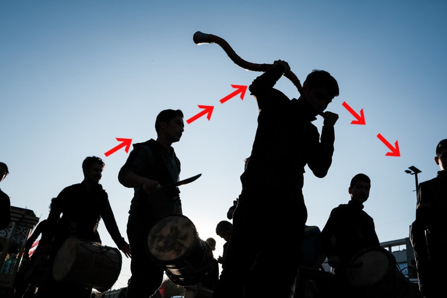
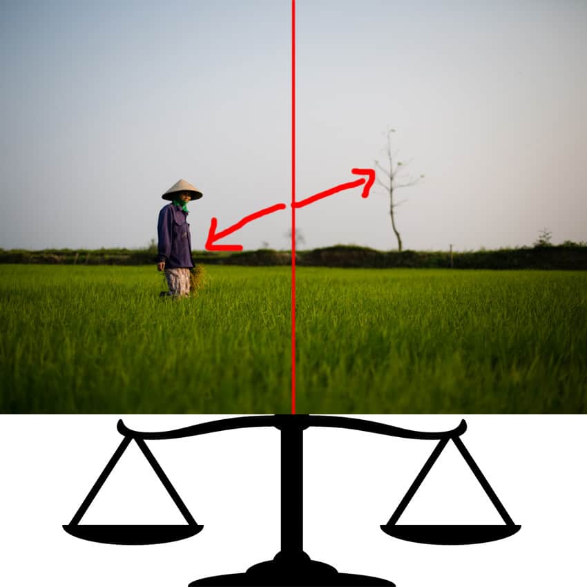
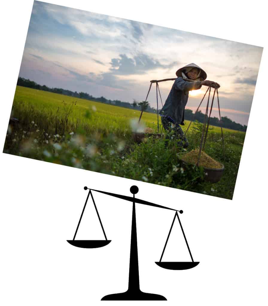
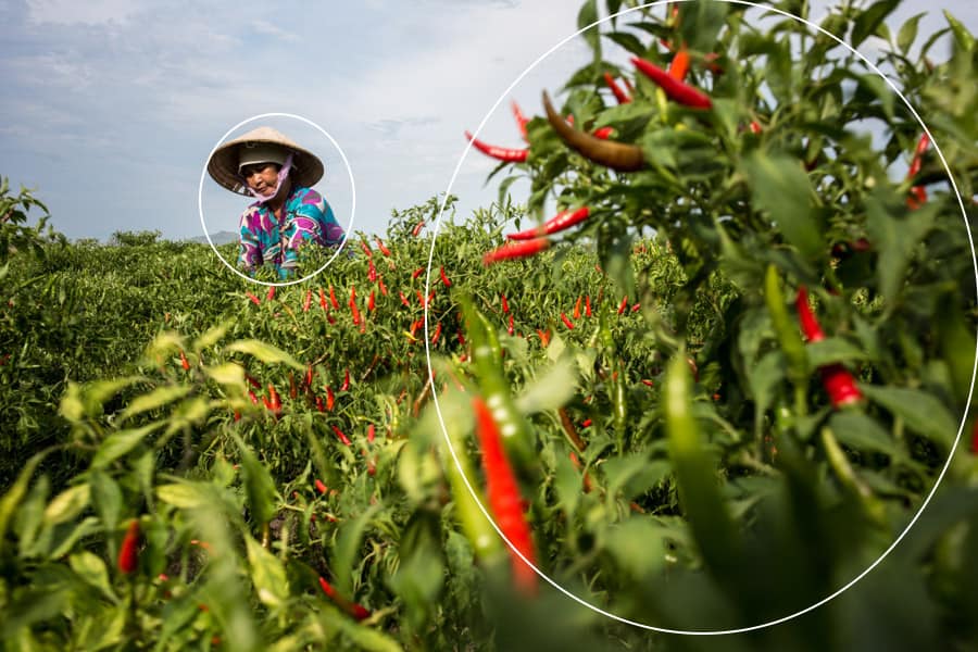
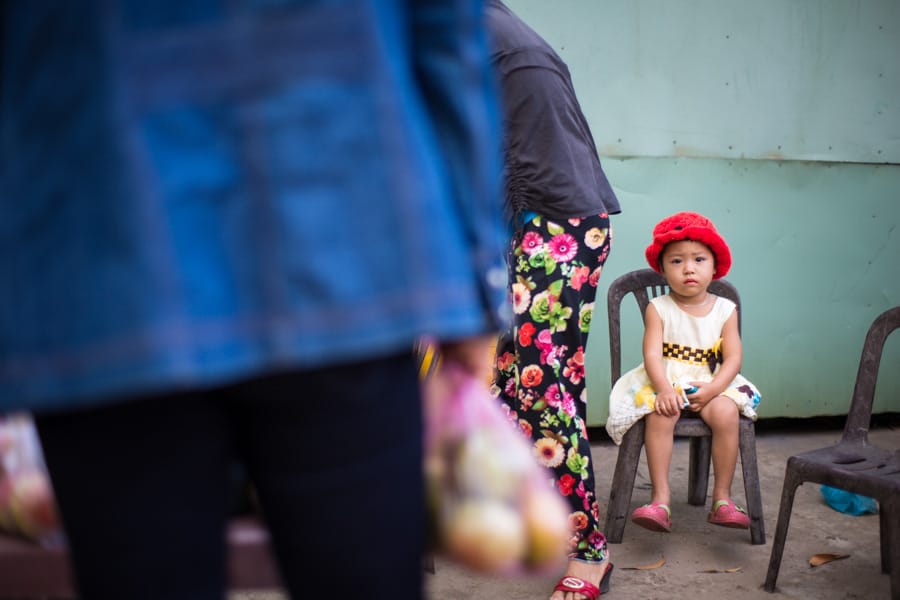
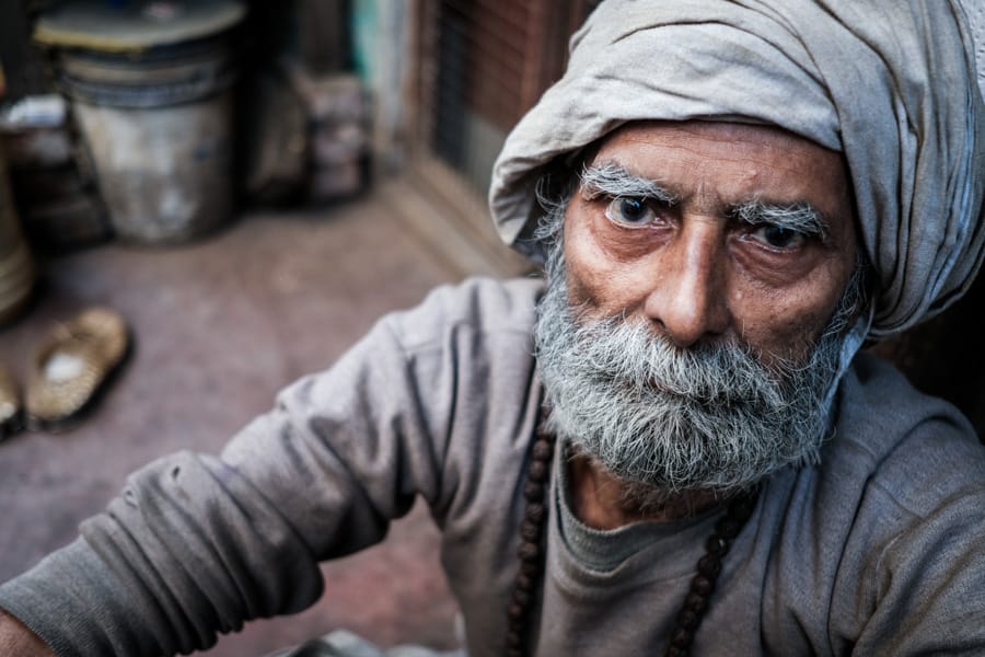
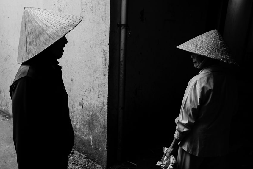
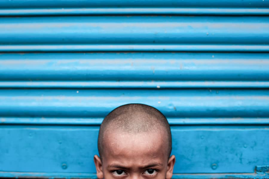
There are a lot of photography tutorials available online discussing balance in photography composition and aesthetics in general. My goal here is to try and have another take on balance in photography by applying it specifically to people photography – meaning busy, dynamic situations that quickly evolve before our lens. The concepts I talk about below have emerged over years of taking photos of people in Asia, and of teaching photography. I don’t pretend that these combine to make one ultimate truth. Simply, how I feel. So, let’s get started and have a look at some different ways and techniques to bring balance to, or deliberately create unbalance in, your images. Balance, to me, is all about how different elements in the frame weigh up against each other. If some elements are overwhelming (bigger, more colourful, more emotional, etc…) they can overpower the frame and give a sense of unbalance. Personally, I see balance in photography and design being the same as balance in real life. If things feel too heavy on one side, the image is unbalanced. If the elements are spread within the frame in a way that they seem to physically balance each other, then there is balance in the image. This is what I think of as the visual weight of the elements within the frame. Now, this doesn’t take into account the “emotional weight” of an element – but we’ll get to that later. I believe it’s easier to start thinking in terms of visual weight first, before later on including the emotional components of elements. I’m going to develop this idea of visual weight as it’s the one I find the most interesting. I won’t list all the different types of balance you can find in photographs (colour balance, tonal balance, etc…); rather, I’ll attempt to give practical tips. So you can find better ways to balance or unbalance your images right there on the spot. Think of each element in your frame as having actual weight. Not in the “how many kilos do they weigh?” sense, of course! Weight, in this case, is defined by where in the frame your element is located, or by how much contrast or vivid colour it has. Something we’ll talk about in more detail later on. But what would happen if you were to place the frame on a scale? Would the frame tilt to one side or the other, or would it remain balanced in the middle of the scale? I think this is the best way to understand visual weight, and this is what we’re going to focus on in this article: How can we use the visual weight of an element to balance or unbalance our images? In contrast, an unbalanced image doesn’t feel right. It almost feels like it’s going to tilt to one side and capsize. First things first: if something is big, it feels heavy. If something is small, it feels light. So far, so good, right? Right. Things get more interesting now when we think about how to spread these elements in our frame. It’s said that the closer the elements are to the edge of the frame, the “heavier” they feel. A smaller element, very close to the edge of the frame, will feel heavier than a bigger element in the middle. This one is a bit trickier, right? Think about it like a pivot. The further from the fulcrum you apply pressure, the more impact it has. That’s gravity for you! How do you feel about this image? Even though the element on the right is much smaller than the middle one, it seems to bring back some kind of balance due to its position, which is close to the edge of the frame. This is one of the reasons why, I believe, we tend to avoid placing our subjects on the very edge of the frame (most of the time). First, to leave a bit of room for the subject to “breathe”, and also to avoid throwing off the balance of the overall image. It is also said that the elements in your frame which have more contrast, or warmer colours, bear more visual weight (with red having the most visual weight). And of course, elements in focus have more visual weight than out-of-focus elements – because our eyes spend more time looking at sharp things, which instantly makes them feel “heavier”. Think about the old “one kilo of stones against one kilo of feathers” truism. Stones are heavier than feathers, so 1kg of stones will be much smaller than 1 kilo of feathers. Now, think that the weight of the stones is described in visual design as brighter, having more contrast or vivid colours. That makes the “stones” element heavier than the “feather” element. But even though the “feather” element is bigger, it doesn’t feel heavier – just like in the image below. Also, for whatever psychological reason, whenever we look at images of people, our gaze tends to go directly to the person in the frame; more specifically, to their face and eyes. That dramatically increases the visual weight of the human element. So if your element is a person with visible eyes, its visual weight is much greater, like in the image above. When someone in your image is looking in a certain direction, the viewer’s brain unconsciously creates an invisible line following the direction of their gaze. We’ve already discussed this in more depth in our tutorial about creative portraiture. Now, here’s another very interesting thing to consider, and the reason why it took me so long to finally finish this tutorial – having started it in 2016, believe it or not! We, as human beings, prefer things visually when they’re placed in one of the thirds of a frame. Yep, the good ol’ Rule of Thirds. So, even if our subject is placed on one side of the image and nothing comes to balance it on the other side, it still just tends to feel right to our brains. (Don’t worry, I’ll discuss this point in more detail further on!) Now, this would completely shatter everything I just talked about, if we were only dealing with the act of photographing one subject, like focusing on close-up portraits, for example. But of course, photography gets much more interesting when there’s more than one subject in the frame. Which is why it’s so important to understand visual weight in the way I described it above. It’s also said that foreground elements carry more visual weight than background elements. A point that I think photographers should clearly think about, or “feel” their way into, when taking photos of a moving scene. Well, creating an evenly balanced image is what helps the viewer to feel calm and relaxed. A balanced image just feels more peaceful. So it works well when you’re taking photos of peaceful and quiet moments. It’s actually the same feeling that viewers experience when we place things in the middle of our frame. We don’t want to surprise the viewer, nor make them feel uncomfortable. These images are easier to look at, to understand, to “digest”. Symmetry is a quick and easy way to achieve balance in an image. So why disrupt that? Sometimes you might want to! You see, unbalancing your images can be great when you’re taking photos of more dynamic things, like your subject performing a dynamic action, or when you want the viewer to feel uncomfortable. Essentially, it really depends on your subject, on what they’re doing, and on what emotion you want to trigger in the viewer. Creating balanced or unbalanced images is entirely up to you, and will lead to different emotions in your images. So you should bear that in mind, particularly if you want to have the viewer experience your images in different ways. I must admit, I tend to instinctively balance my images, to create more compelling compositions. I often find myself thinking, “how could I unbalance that in a nice way?” When you’re on the spot, in the thick of the action, it isn’t always the easiest task. But it is rewarding. I also believe that your choice of composition depends on how you, as the photographer, felt when taking your picture. How you felt about the combination of background and foreground elements available. It would make sense to place your main subject in the middle, if your background is clean and symmetrical, for example. But maybe you see things differently. There are lots of factors to take into consideration – but what you need to keep in mind is that people tend to prefer looking at photos that are well balanced. Why? Because they’re easier to look at; they feel more comfortable. Also, balancing your images with other elements in the frame leads the viewer’s eyes throughout the whole frame – allowing them to spend more time looking at the image, and for your stories to run deeper. Even in dynamic environments, we still have the urge to bring back balance to our images, just because it “feels right”. So what techniques can we use to bring back balance into our dynamic, busy images? Check out Part 2 of our photography tutorial about Balance in photography.What is Balance in Photography?
Understanding Balance as Visual Weight
How to Use the Visual Weight of Elements

An Exception to The Rule of Thirds
Foreground Element vs. Background Element
Why Balance or Unbalance an Image?
Good articles👍
Thank you Minarni! I hope you are well!