
Balance in Photography Composition: A Fresh Take on People Photography
Balance in the Chaos: A Guide to Dynamic Travel Photography Across Asia
There are countless photography tutorials online discussing balance in composition and aesthetics. However, after years of leading travel photography tours in Asia—from the hectic streets of Dhaka to the quiet tea plantations of North Vietnam—I’ve decided to delve deeper. I want to show you how these theories actually work in the field with real photo examples, not just the usual dry theory you find in textbooks.
My goal is to apply these concepts specifically to people photography in Asia: those complicated, dynamic situations that evolve in a split second before your lens. These insights emerged from teaching photography on the ground. So, while they aren't "the ultimate truth," they are the principles I use to create my own images.
In this guide, we’ll discuss how to bring balance—or intentional imbalance—to your images to get the result you’re actually after. But first, we need to define what "Balance" really means when you're standing in the middle of a crowded street.
Balance in Photography: Understanding Visual Weight
What is Visual Weight?
In photography, Visual Weight is the measurable power an element has to attract and hold a viewer’s attention. Think of it as Visual Gravity. Every object in your frame is competing for the viewer's eyes. The more an element "pulls" the eye toward it, or the longer it "anchors" the gaze once it arrives, the more visual weight that element carries.
The Two Pillars of Weight:
Attraction: How quickly does the eye jump to this element when first seeing the image? (e.g., a bright red shirt in a grey crowd).
Retention: How much "effort" does the brain require to process the element before moving on? (e.g., a complex, textured face vs. a plain white wall).
As a photographer, your job isn't just to "take a photo"; it's to manage this gravity. If you have too much weight on one side with nothing to counter it, your story feels tilted and unstable. If you balance those weights correctly, you lead the viewer on a deliberate journey through the entire frame.
To me, balance in photography and design is identical to balance in real life. If a photo feels "heavy" on one side, it’s unbalanced. If elements are distributed so they seem to physically support each other, the image feels grounded. It is all about the visual weight of your subjects. It’s almost like applying the rules of gravity to an image.
Imagine placing your photo on a scale. Would the frame tilt, or would it remain level? An unbalanced image often feels like it is about to "capsize," which can make a viewer feel uneasy—though sometimes, that is exactly the goal. I think this is the best way to understand visual weight, and it’s what we are going to focus on: How can we use visual weight to balance or unbalance our images?
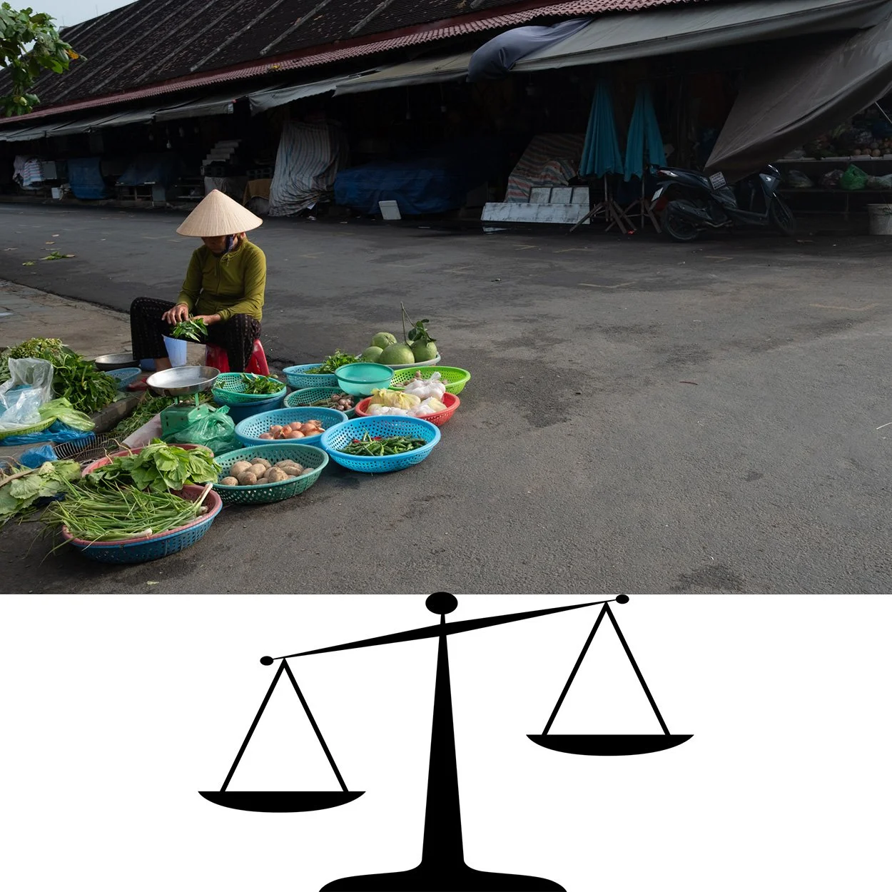
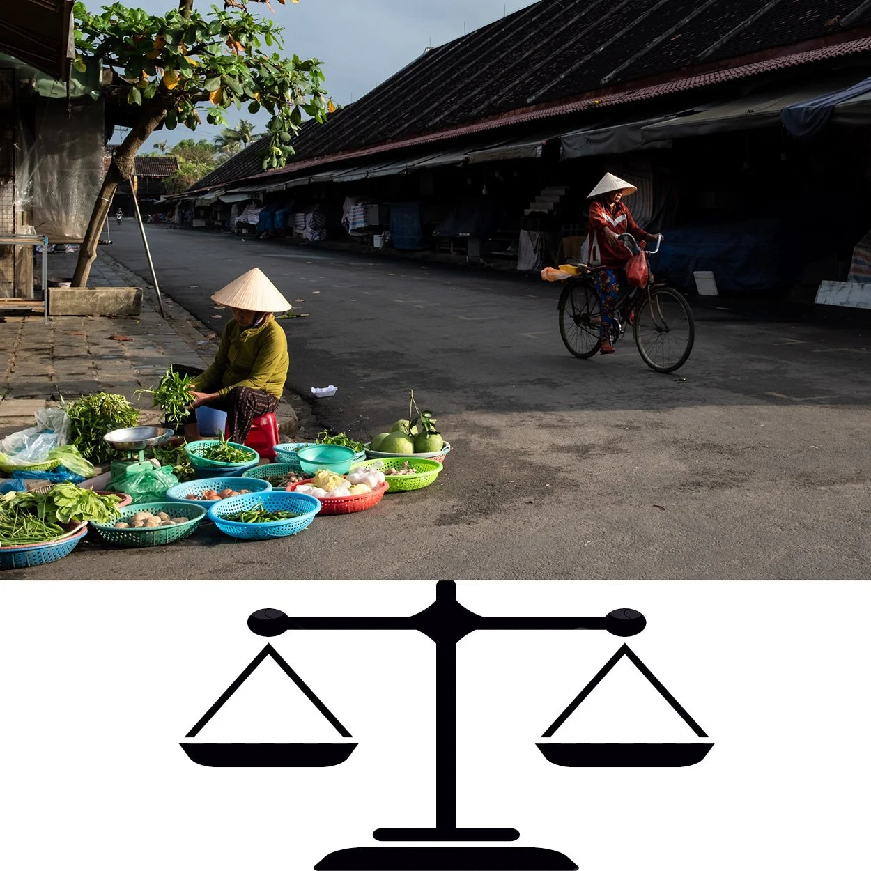
What Elements Affect Balance and Visual Weight?
Think of every element in your frame as having a physical mass. While we aren't measuring kilograms, we are measuring "visual weight." Now, it’s not as simple as real-world weight where only mass is considered (and yes, I know weight and mass are different things, but please—this is a photography tutorial, not a physics lecture!).
In photography, several factors affect how "heavy" a subject feels to the eye. To help you "feel" the weight on the spot during a tour, use this quick reference table:
| Element | High Visual Weight | Low Visual Weight | How It Affects Balance |
|---|---|---|---|
| Placement | Edges and corners of the frame | Center of the frame | Objects far from the center feel "heavier" due to leverage. |
| Size | Large elements/subjects | Small elements/subjects | Big feels heavy; small feels light. |
| Brightness | Highlights/Bright spots | Shadows/Dark areas | The eye is naturally drawn to the light. |
| Contrast | Sharp jumps (Dark vs Light) | Soft gradients/Flat light | High contrast creates a "heavy" focal point. |
| Color | Warm (Red, Orange, Yellow) | Cool (Blue, Green, Grey) | Red is the "heaviest" color in photography. |
| Texture | Dense, complex patterns | Smooth, plain surfaces | Detail requires more "brain power" to process. |
| Sharpness | Sharp, in-focus elements | Blurry/Bokeh elements | We ignore the blur and lock onto the sharp. |
| Subject | People, faces, animals | Objects, landscapes | Our brains prioritize living things over rocks. |
| Gaze | Looking at the camera | Looking away/Profile | The gaze creates an "implied line" of weight. |
| Background | Clean, minimal backgrounds | Complex, cluttered backgrounds | Simple backgrounds make the subject feel heavier. |
| Layering | Foreground elements | Background elements | Proximity to the lens adds massive visual weight. |
How to Use Visual Weight to Balance Your Images
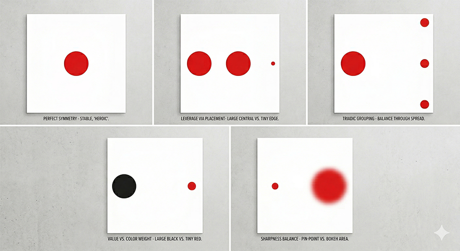
Now I want to show you some real examples of how I use these elements. Let's get out of the classroom and into the street. Here is a quick illustration, showing how you can interpret the above technique visually:

1. Placement within the Frame and Size
To us humans, it’s obvious: bigger things seem heavier. Size is the most immediate factor. However, position changes everything. In both physics and photography, the closer an element is to the edge of the frame, the "heavier" it feels. If you look at the scale metaphor, the edge of the frame acts like the end of a lever.
Pro Tip: If you have a large subject slightly off-centre, try balancing it with a much smaller subject placed right at the opposite edge. This creates a "lever" effect that brings stability to a chaotic street scene.
2. Brightness, Color, and Contrast
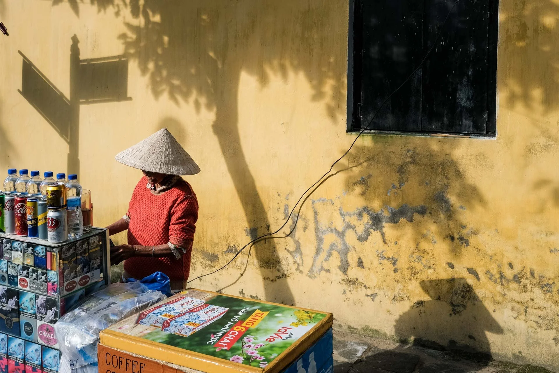
I group these three because they usually work as a team. Brightness, contrast, and color are what draw our eyes first. This is why I often try to place my subjects in areas of high contrast; I want the viewer to see the subject first and understand the story instantly (mostly when it is about people photography). Warm colors—specifically Red—have the most visual weight. You can balance a massive grey building in the background just by having a tiny person wearing a red shirt in the foreground.
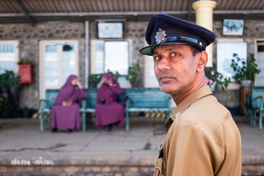
3. Texture and Details / What’s in focus and what is not
We can remove some visual weight from certain elements in an image by having them out of focus. Our eyes tend to spend more time looking at sharp elements in an image, which increases its visual weight. Focus is a weight-management tool. By shooting with a wide aperture, you "lighten" the background by blurring it out. This forces more visual weight onto your sharp subject. Conversely, if everything is sharp, every detail in the background starts adding weight to the scale, and you have to be much more careful with your framing. This is the reason why shooting with really wide apertures will simplify the image by removing most of the background’s visual weight, which helps focus our attention on the subject only. Which is why I often call shooting with wide apertures “the easy trick” in order to simplify your images.
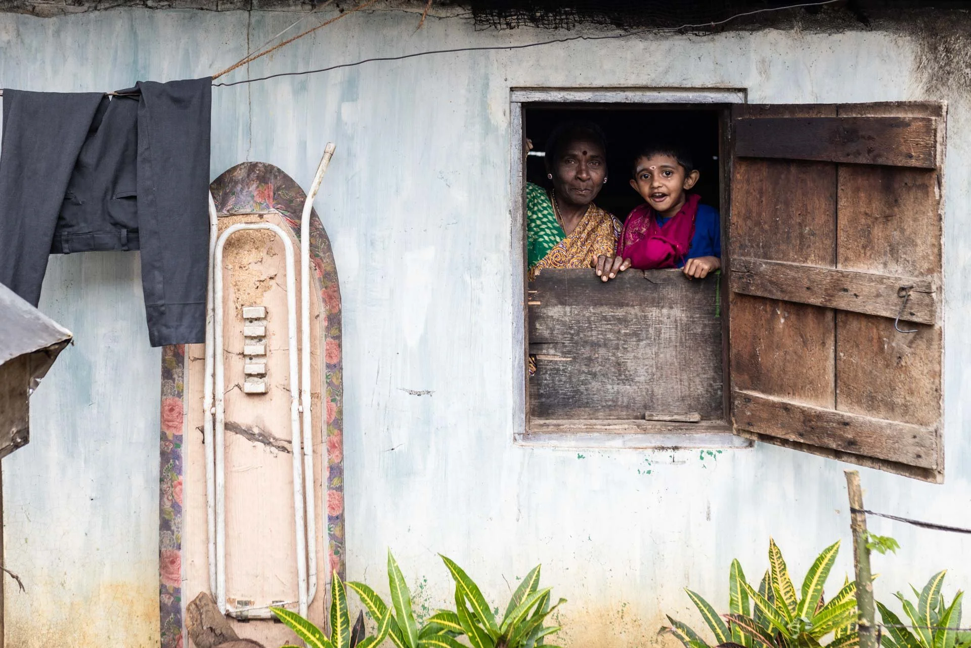
4. Subject Matter: The Human Factor
Whatever it is, the way you Our eyes are hardwired to find other eyes. I believe this is an evolutionary leftover—we need to know if someone is a friend or a threat. In a photo, a human being (especially a face) is incredibly "heavy." You can have a giant truck on one side of the frame, but a small child looking into the lens on the other side will still hold its own on the visual scale.tell your story online can make all the difference.

5. The Power of the Gaze
In people photography, and especially for travel portraits, the direction your subject is looking into creates an "invisible line." This line has its own weight. If a subject on the left looks toward the right edge, they "push" the weight of the photo in that direction. It’s like an invisible finger pointing across the frame. And this will lead our eyes inside or outside of a frame, helping with creating balance or unbalance on our photos. This is the reason why the rule of thirds tells us to have our subject look into the picture, and not the frame.

6. The Complexity or Simplicity of the Background
A busy, cluttered background adds "noise weight." It makes the whole frame feel heavy and sometimes hard to analyse. I often look for "pockets of light" or simple walls to place my subjects against. A simple background acts like a clean slate, allowing the subject’s weight to be the only thing that matters. Once again, it really helps to try and place your subject (or at least your subject’s face) in front of a clean background.

7. Foreground vs. Background Elements
Foreground elements carry massive visual weight because they are physically larger in the frame. When I’m shooting a moving scene, I’m constantly "feeling" the weight of things passing close to my lens. A blurry shoulder in the foreground can be a great framing device, but if it's too large, it will sink your "visual boat" on that side.

8. The use of negative space to bring back balance
Negative Space is the "quiet" part of your image—the empty sky, the shadow, or the plain wall that surrounds your subject. While it contains "nothing," in terms of composition, it carries massive Visual Weight.
Think of negative space as a vacuum that pulls against a dense subject. If you place a heavy subject (like a dark, textured vendor) on the far left, you can actually bring the image back into balance by leaving a vast, clean area on the right.
This works because negative space gives the subject "room to breathe" and prevents the frame from feeling claustrophobic. It creates a minimalist balance where the emptiness is just as important as the subject itself. In the busy streets of Asia, finding these pockets of nothingness is often the only way to make a chaotic scene feel organized and intentional.
9. Vertical Balance: Keeping Your Image Grounded
While we usually think about balance as a left-to-right seesaw, there is also vertical balance—the weight of the top of your frame versus the bottom.
In most travel photography, the "ground" (the bottom of your frame) acts as the foundation. If the top of your image is filled with heavy, dark clouds or overhanging temple roofs, and the bottom is just empty pavement, the photo can feel "top-heavy," as if it’s about to tip over toward the viewer.
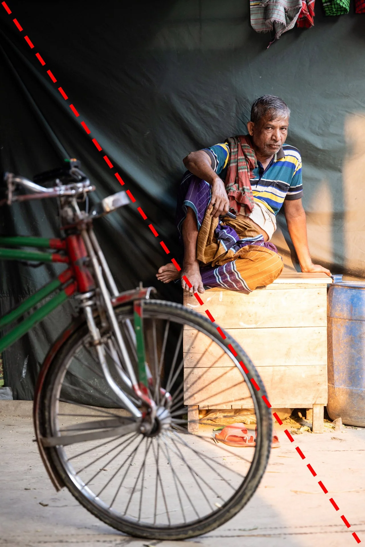
The Split Effect: You can split your image in 2 by drawing a diagonal line through the frame. This usually brings a good balance to your vertical images.
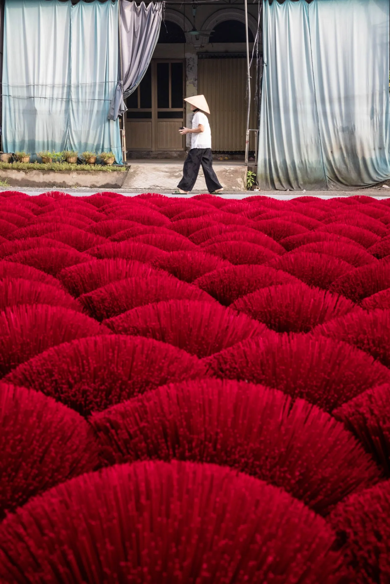
The Anchor Effect: I often use a strong foreground element—like a shadow, a textured street, or a colorful rug—at the bottom of the frame to "anchor" the image. This provides a solid base that allows the viewer's eye to wander upward.
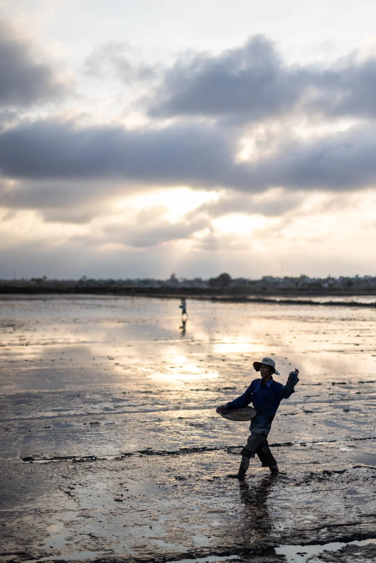
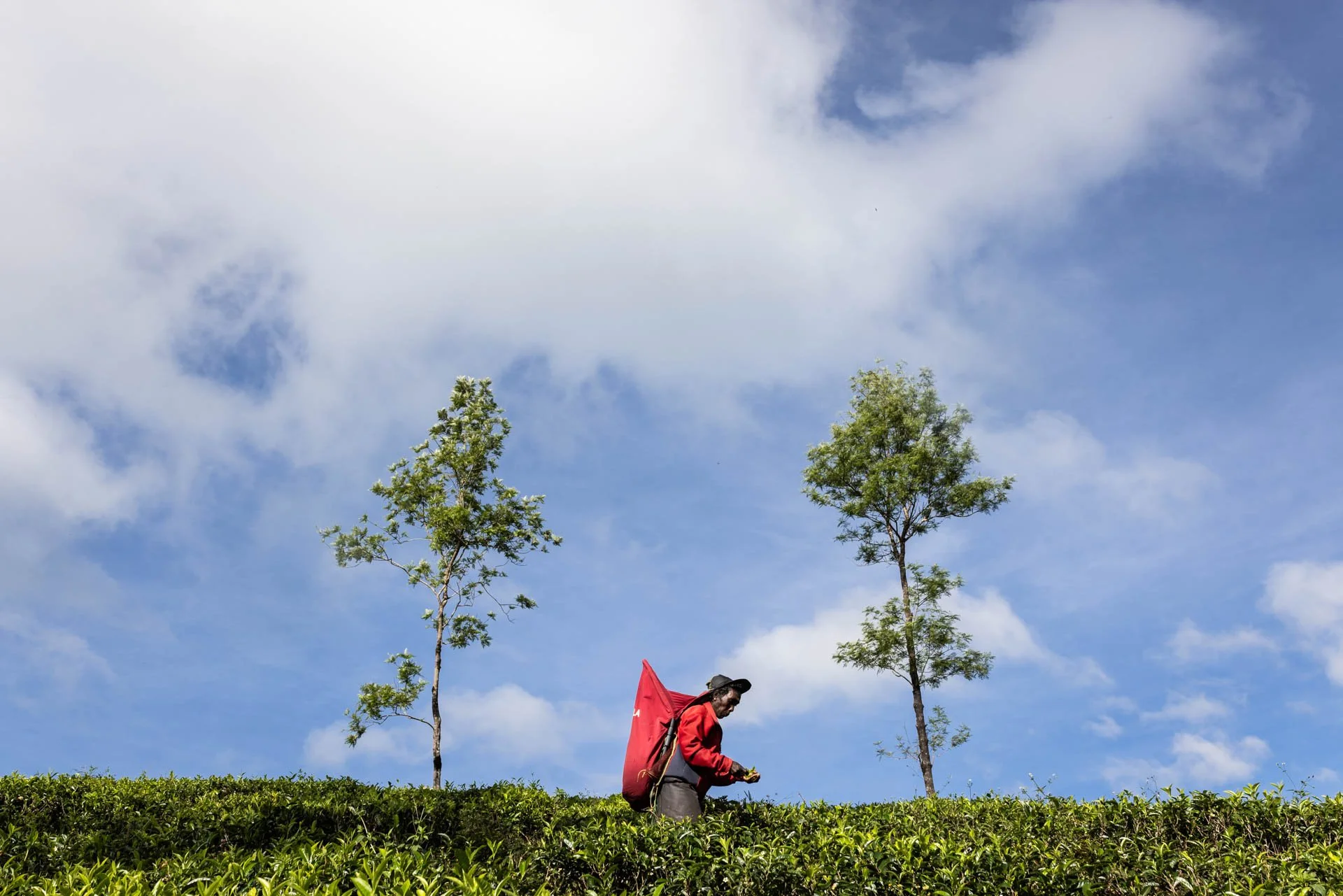
Sky vs. Earth: If you have a massive, dramatic sky, that’s a lot of visual weight. To balance it, you need something equally "heavy" at the bottom, like your subject, a human presence.
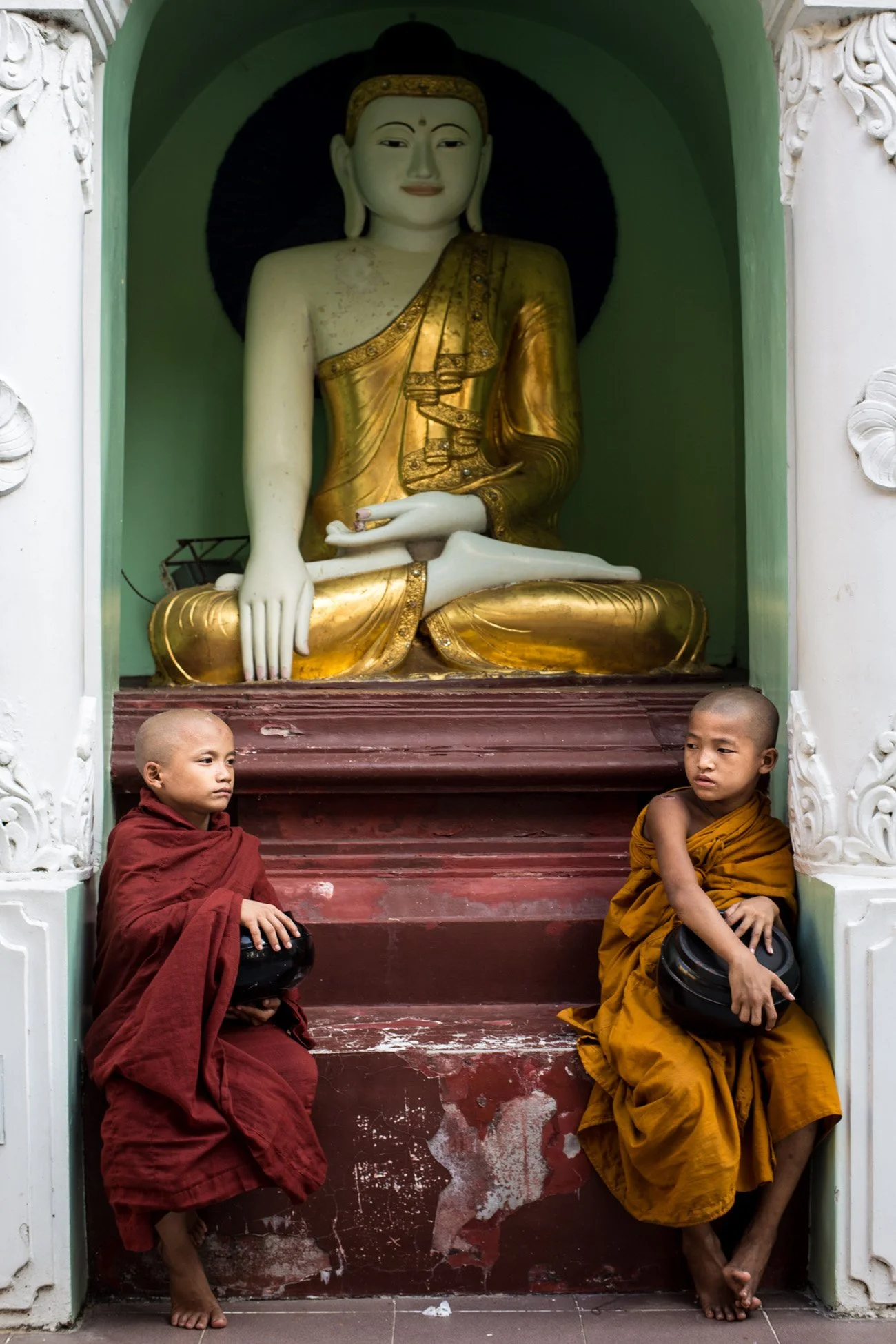
Use triangles: I find that using triangles in vertical images is a very good way to keep your images grounded. Try to create a triangle that isn’t upside down in order to make the image feel more grounded.
Should You Balance or Unbalance Your Images?
The short answer is: both. Whether you choose to balance or unbalance an image depends entirely on the "vibe" or narrative you want to convey. Think of balance as a tool for harmony and unbalance as a tool for tension.
When to Balance
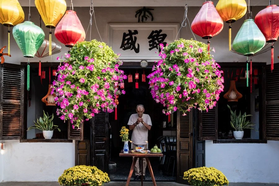
Balanced images feel stable, calm, and well composed. In the context of commercial or lifestyle work—like shooting resorts or classic travel images in Hoi An Old Town—balance is usually the goal. It suggests peace.
Symmetry: Great for architectural shots of temples or centred portraits that feel "heroic."
Asymmetry: Useful for environmental portraits where you balance a subject on one side with a background element (like a distant boat or a sunset) on the other.
When to Unbalance
Unbalanced images create visual tension, movement, or unease. For my street photography in Bangladesh or Vietnam, intentional imbalance can make a shot feel more candid and "raw."
Creating Direction: Placing a subject far to one side with "dead space" behind them makes them feel like they are moving fast or perhaps being left behind.
Directing Emotion: An unbalanced frame mimics the chaos of real life. It feels less like a "postcard" and more like a real moment caught in passing.

The Rule of Thirds Exception
Here is something that bothered me for years: if we are supposed to "balance" our images, why does the Rule of Thirds tell us to place our subject to the side? It seems counterintuitive.
1. The Rule of Thirds Uses "Leverage"
Remember our scale metaphor. Symmetry is placing two objects of equal weight on each side of the frame. It’s balanced, but it is predictable.
The Rule of Thirds places your subject far to one side. This is visually unbalanced, creating that tension I mentioned earlier. But the secret isn't just leaving it there; it's about what you do with the rest of the frame.
2. How to Counter-Weight the Rule of Thirds
You can balance a heavy subject which is placed along your line of thirds by using another element on the opposite side. Now consider the theory part at the beginning of this article to define what kind of element to add on the other side:
Size (Small Counterpoint): One large person on the left vs. a small house in the distance on the right.
Negative Space: A vast, empty sky can actually pull enough "visual air" to balance a dense subject.
The Gaze: If your subject is on the right third looking left, their "look" fills the empty space with energy, balancing the frame.
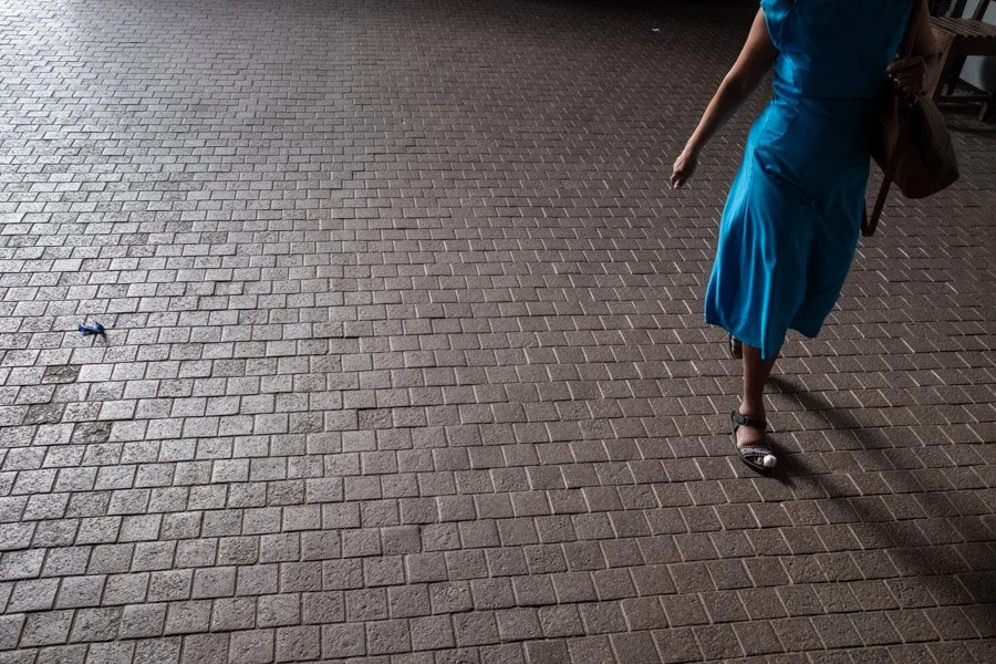
Tilt your frame: I often find that tilting my frame to enhance the visual weight helps to justify the fact that an image is unbalanced. In the image below, you can see that my main subject is bigger and in focus, making it much heavier than the other person. I reinforce this sense of imbalance by tilting my frame.

Practical examples: How do I balance or unbalance my images, and why?
I personally tend to balance my images. It's a choice. I shoot street-inspired travel photos in Asia, where, despite the crowds, there is a certain flow and peace to life. I want my images to be beautiful and tell deep stories. I’m not looking to "shock" my viewers; I want them to linger.
I also usually combine several of these techniques to create more punchy images. My main goal is for the viewers to understand my images instantly, to know what the subject is and what the story is about. I want my viewers’ eyes to travel through the image in a certain way: first to identify instantly what the subject matter is, and then to travel through the frame to understand the context (story) around my subject.
Our photography tours in fishing villages in central Vietnam are perfect locations to play and practice! There are so many moving elements in front of us that we can easily place them in different areas in our images and see how it affects the balance of our images.








The use of triangles:
Fill your frame by placing 3 elements in a triangle will lead the eyes in a very “pleasing way”. This is what happens when you apply the rule of thirds and push it to the point to keep adding more elements in your frame. This will eventually lead to a golden ratio. I try using triangles that feel like they are grounded to the floor. You could also try to get the opposite “unstable” feeling by creating upside-down triangles, where the image isn’t going to feel grounded.

I also like using symmetry to compose my images and keep them very well balanced.
Practice Tips:
Find a scene with a simple background and wait for the leemtns to move in different areas of your frame. You will clearly be able to see the effect on your subject’s placemenet in the frame on your overall image balance.



























Frequently Asked Questions (FAQ)
Q: What is the most important element of balance in street photography?
A: In my experience, it is the "emotional weight" of a person's eyes. Our brains are hardwired to find faces, so even a tiny person in a massive landscape can act as the "heavy" anchor for the whole shot.
Q: Does gear affect balance?
A: Absolutely. A fast lens (like a 35mm f/1.4) allows you to "shave off" the weight of a busy background by blurring it. If you're shooting with a phone where everything is sharp, you have to work much harder to balance all those details.
Q: How do I practice this on my own?
A: Go through your old photos. Look for the ones that feel "off" or "uncomfortable." Try to "weigh" the left side against the right. You’ll quickly see where you missed a counter-weight.
Ready to Level Up Your Portfolio?
Understanding balance is the difference between a snapshot and a compelling story. If you want to practice these techniques on the ground with expert guidance, join one of our Photography Tours in Asia . We spend our days diving deep into street composition and finding beauty in the chaos.